Mood-Boosting Color Palettes for Every Room (and Every Mood)
Some days feel heavier than others, but what if the spaces around you could help lift the weight? The colors that surround you have more influence than you think. They whisper calm or energy, focus or release. They can nudge your mood gently or offer a bold, emotional reset.
Photo by Zak Chapman
There was a time when every room in my home wore the same neutral shade. It felt clean and safe, but something was missing. I began to notice how much more grounded I felt in the green of the woods or how sunlight warmed everything when it bounced off golden tones. That realization sparked a quiet revolution in my home. One room at a time, color by color, I started to feel better.
Color has a significant impact on our mood that we often overlook. The hues surrounding us can calm our nerves, elevate our spirits, or make us want nothing more than to curl up with a book and a blanket in a corner somewhere. And when you’re building, renovating, or even simply redesigning your home, perhaps a single room, color can easily be your greatest asset.
The right color is more than a design choice. It is emotional architecture. From the soft serenity of a lavender bedroom to the spirited pop of a citrusy kitchen, color can shift the energy of your entire day. By tuning into your moods and the purpose of each room, you can create an environment that genuinely supports how you want to feel.
This isn’t just about paint samples or trends. It’s about transforming your home into a place that actively uplifts you. Mood-boosting palettes can help you rewrite your everyday experience, one hue at a time.
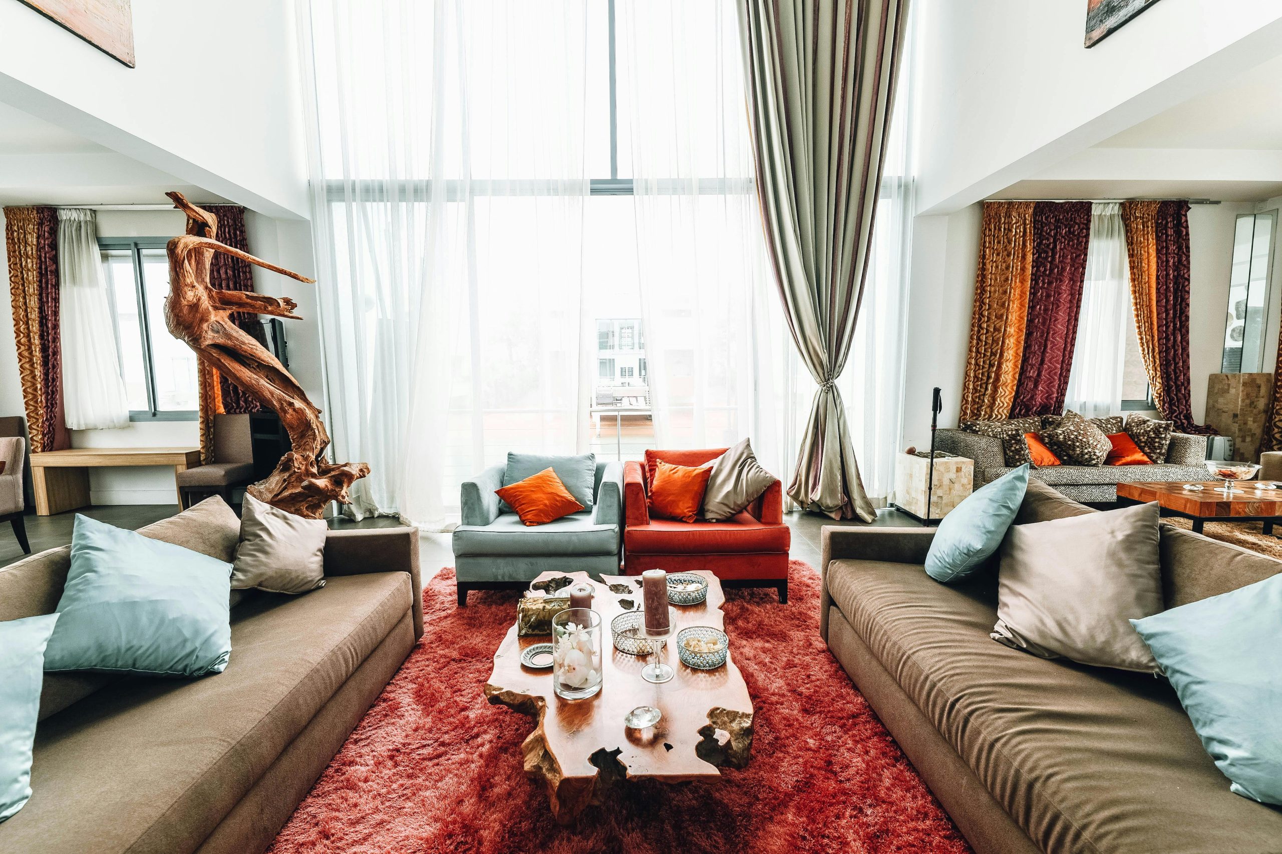
Living Room: Warm Neutrals with a Touch of Personality
The living area is where we go to relax, congregate, or binge-watch programs that we vowed would only be watched once. It’s a multitasking space, much like you. A solid foundation here? Consider soft beige, creamy ivory, or warm beige. These colors evoke a sense of calm rather than appearing overly cold.
Next, add a splash of expressiveness. Terracotta throw pillows. Mustard curtains. A teal armchair. These small pops of color enliven the space without overwhelming the senses. What you want is a space that welcomes you in, not one that screams from the entrance.
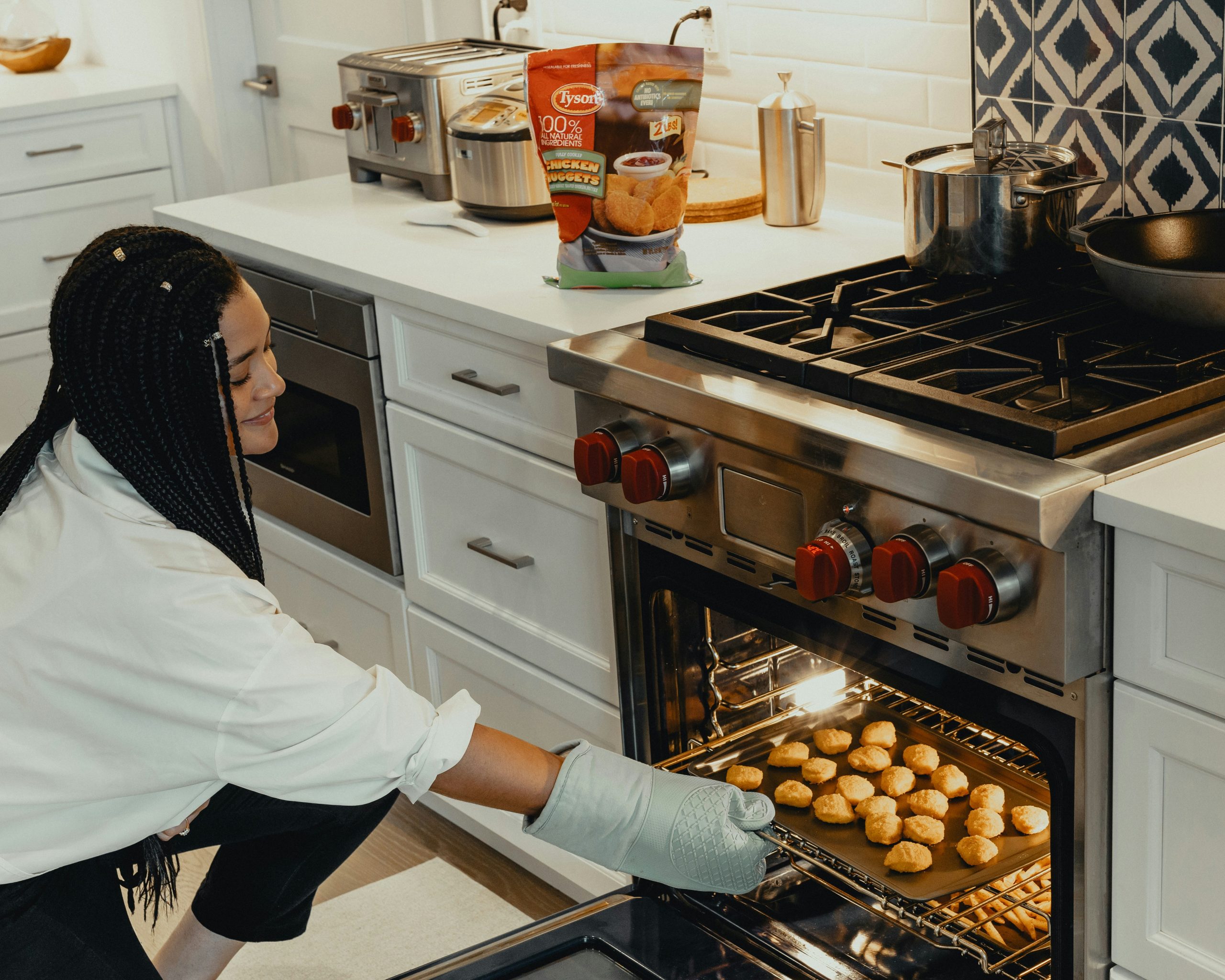
Kitchen: Bright Colors that Get People Going
The kitchen is where the action is. Mornings, coffee, chatter, the occasional burned toast—it all occurs here. For that reason, this area must have lively colors surrounding it. Pale yellows, pale orange, or perhaps a dramatic sage green can awaken the walls and infuse the space with warmth and energy.
Deep blue cabinetry, forest green cabinetry? Beautiful. Burnt orange accent wall? No less grounding. Used thoughtfully, all of these colors trigger hunger and bring happiness. And where natural light is plentiful, as it often is in kitchens, they will shine.
Bedroom: Blues and Greens that Inspire Serenity
Your bedroom should be a haven of relaxation after a day of activities. Cool blues, soft greens, and pale lavenders all work perfectly here. They possess a relaxing, easy-going nature that signals to your mind it’s time to unwind.
Use a deep blue wall behind the bed with soft gray bedding. Or a dusty olive hue with warm wooden accents. Even pastel colors will do if you want a lighter mood—but make sure they are soft, not sharp.
Bathroom: Soothing Colors That Are Fresh and Peaceful
Bathrooms rarely receive the credit they’re owed. And still, they’re where you can lock the door and have five minutes of solitude. Paint yours a hue that encourages that.
Think spa: pale seafoam, cool stone gray, or creamy white with a natural texture. These hues are clean-feeling, not sterile. Top them off with wooden or woven accents, and you have a space that is soothing rather than chilly.
And, of course, even the smallest bathroom can be helped by well-conceived color. A little does go a long way.
Office or Creative Space: Balanced, Intentional Energy
This is all dependent on what you need from the space. Concentration? A soft green is best—it calms the eyes and enhances concentration. A creative boost? A touch of coral or lively blue is the answer.
You don’t have to repaint all of the walls. Adding color through decor, art, or bookshelves can change the entire atmosphere of the space. Avoid being too dramatic unless your productivity depends on intensity. The intention here is not to distract but to support.
Entryway: A Vibrant First Impression
Your front entrance establishes the mood before anyone even crosses the threshold. Make it welcoming? Try earthy tones and warm colors such as clay, rust, or honey. Need drama? Embrace a moody look with charcoal or deep plum, complemented by warm lighting and natural accents.
This is the handshake of your home. It is small, so don’t be shy about letting it get a little playful. Paint the door interior. Suspend bold artwork. With color, express yourself before anyone else does.
Bringing All the Colors Together
Whether you rent a small apartment or lease a sprawling home, one of the most powerful, easiest tools you have for controlling how your space makes you feel is color. And, sure, trends will ebb and flow (millennial pink, anyone?), but most importantly, a space must evoke a sense of emotion.
Similar to how a home construction company designs the building, your color scheme creates the emotional groundwork of your home. Your first layer of paint can do more than transform a wall—it can alter the mood of your entire day.
Let Color Be Your Everyday Magic
Your home should be more than functional. It should feed your spirit. When you step into a space that matches your energy or gently guides it in a better direction, you feel the difference immediately. Such intentional design has the power to heal and inspire.
Choosing the right palette does not mean sticking to design rules or chasing every trend. It means paying attention to how you feel and letting that guide your decisions. Whether you’re craving comfort, energy, clarity, or calm, a color story is waiting to be told in your space.
Let your walls, fabrics, and accents speak the language of your soul. With each thoughtful choice, you craft a home that reflects your inner world and helps it thrive. Color is not just decoration. It is a transformation.


Great blog! I enjoyed reading it. The way you explained everything in such simple and clear words made it easy to follow. Sometimes blogs can get too technical or confusing, but this one was straight to the point and very helpful.
Your writing style is also very engaging. It kept me interested from start to finish, and I didn’t feel lost at any point. It’s always nice when a blog teaches you something without making it feel too heavy or complicated.
I’m looking forward to reading more from you. If all your blogs are like this, I’m sure they’ll help a lot of people. Keep up the great work!